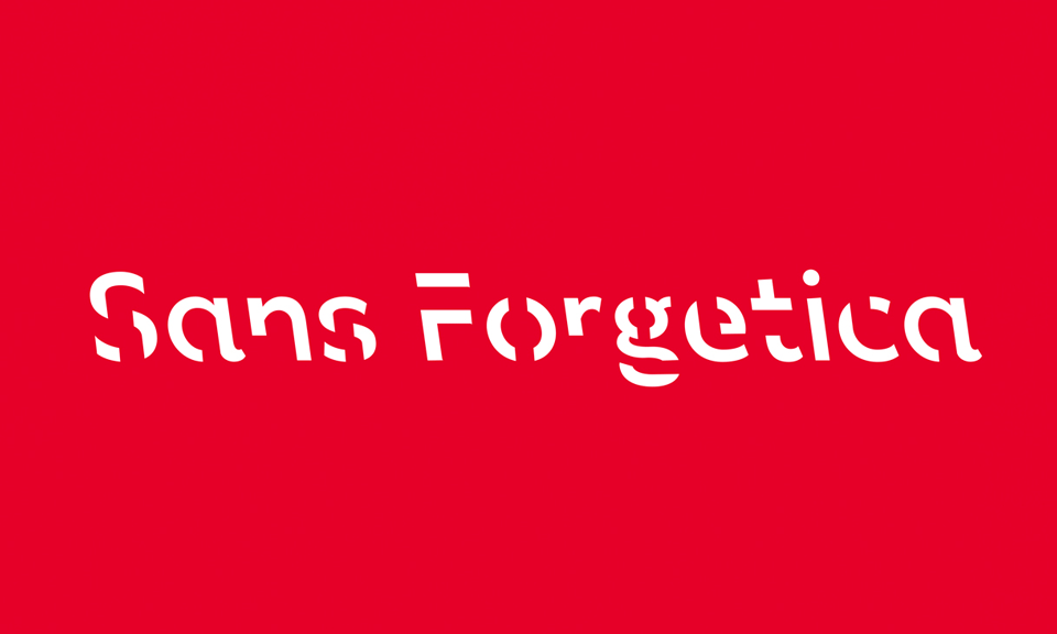
Sans Forgetica, the font designed to improve your memory
A new typeface can help your brain integrate deeper information, according to researchers, and this has nothing to do with magic, it's the science of effort.
English source: washingtonpost - introducing sans forgetica font designed boost your memory
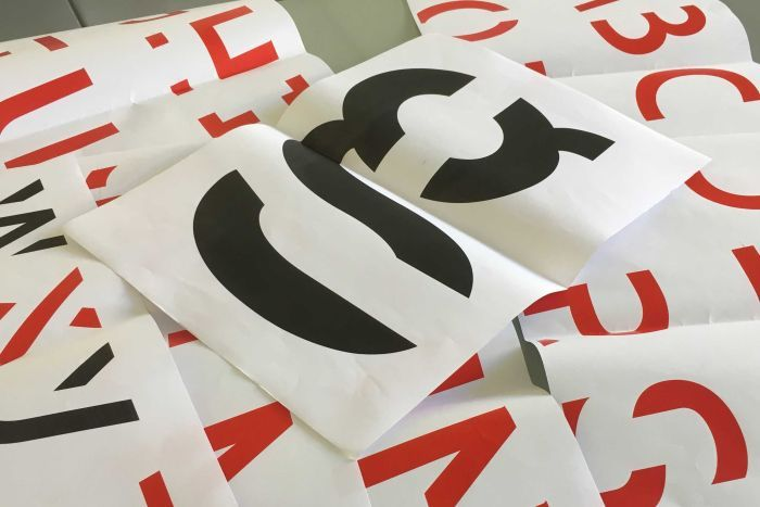
Psychology and design researchers from RMIT University in Melbourne have created a font called sans Forgetica, designed to improve the retention of information from readers. It is based on a theory called "desirable difficulty", which suggests that people remember things better when their brains have to overcome minor obstacles when processing information. Without Forgetica is elegant and inclined in the back (inverted italics), with intermittent gaps in each letter, which serve as a "simple headache" to the reader, according to Stephen Banham, designer and lecturer of RMIT who contributed to the creation of the typeface.
"This should be hard to read but not too difficult," said Banham. "By requiring this additional Act, memory is more likely to be triggered."
In designing sans Forgetica, Banham said that he had to go beyond his instinct, resulting from 25 years of studies in typography. Clarity, ease of treatment and familiarity are generally guiding principles on the ground. The inverted italic of sans Forgetica is unfamiliar to most readers, since the type of backward inclination is usually only used by cartographers to indicate rivers. When the openings in the letters, they make the brain think because it has to identify the shapes.
The team tested the effectiveness of this policy, as well as other intentionally complicated fonts, from 400 experienced students in the lab and online. It found that "without Forgetica is far enough away from design principles without becoming too illegible and facilitates memorisation", according to a press release published on the University's website.
A logical continuation of Oppenheimer's work
In some respects, sans Forgetica is a continuation of the work of Daniel Oppenheimer, Professor of psychology at Carnegie Mellon, who presented a similar idea about the "desirable difficulty" called "disfluence" during his work at the University of Princeton in 2011. The terms are different, but the principle is the same: a minor mental gymnastics helps readers better remember things.
Oppenheimer's team relied on contrast and size to overcome mental barriers rather than a foreign police. In an experiment, the team asked 28 University students to read information about two masked creatures, the pangerish and the norgletti. The color information has been printed in gray, in 12 characters Comic Sans or Bodoni. The norgletti profile has been printed in a 16-point Black Arial font.
The team distracted the students 15 minutes after reading about the animals and then questioned them; the students remembered 87% of the strange facts, the information of which had been more difficult to read, and 73% of the facts of Norgletti.
Oppenheimer and his team expanded their research for a semester at a high school in Chesterfield, Ohio. They changed the fonts on the instructional material – media, PowerPoint slides and spreadsheets – in several classes and topics in uncommon texts, such as Comic Sans in italics, Monotype Corsiva and Hattenshweiler. After several weeks of teaching, the researchers found that in all subjects, with the exception of chemistry, students who had read "defective" documents obtained much better results.
"This research shows that behavioural interventions can be an important part of school reform," said Oppenheimer in an interview with Harvard Business Review.
Without Forgetica is the first font created for memorisation, said the researchers of RMIT. But Janneke Blijlevens, another researcher of the project, stressed that the typeface should be used sparingly to remain effective. If the reader's brain gets used, it will decode sans Forgetica as easily as if it were Arial or times new Roman, the most common fonts in the world.
"We think it's better to focus on key sections, such as a definition, in texts rather than converting whole texts or books," said Blijlevens at the Washington Post.
An ideal combination during active work with the Activate Brain electronic ear
Combine the sans Forgetica font with the Activate Brain Electronic Ear seems promising, indeed, the principle of "desirable difficulty" will be added to the work of the audio-vocal loop, learning and memorisation would be strengthened with the required deciphering at Visual level.
Want to test by yourself? Without Forgetica is available as a Google chrome extension on the RMIT website.